Design
In this chapter we’ll go deeper into design as the third fundamental pillar for a strong Frontend Engineer. We build the visible part—the interface through which users communicate with the system. A taste for excellence and quality is essential to craft products people love to use.
Utilitas and delectus
In 1908, Adolf Loos wrote that “ornament is crime,” arguing design should be reduced to its minimal functional expression. Loos helped ignite Modernism, influencing architects like Le Corbusier and Mies van der Rohe, who shaped 20th‑century architecture.
Despite post‑modernism and subsequent returns to ornamentation, today’s digital product design remains deeply influenced by Modernism.
When designing, there’s a constant tension between two important concepts: function and emotion—utilitas and delectus. For instance, Le Corbusier painted different walls of the same room in different colors to increase the perception of space—something many would find shocking. All in service of function.
The right solution is almost always somewhere between utilitas and delectus.
Mastery lies in finding the right balance between these two. It’s important to build products that work and solve real problems, but without forgetting the delight of the person using them. Can someone feel a connection with a cold, expressionless product?
When you need to unblock a problem, it’s up to the designer to decide which side to favor. Alvar Aalto often chose the aesthetic side because, above all, “places are for living”—they should be welcoming, not always in absolute service of function.
A brief history of interfaces
Interfaces as we know them today are relatively new—arriving long after the first programs.
Early human–machine communication used punch cards and lights that turned on and off to show results.
We then moved to CLIs—still widely used by technical folks. They’re simple to build and incredibly powerful when you truly understand them.
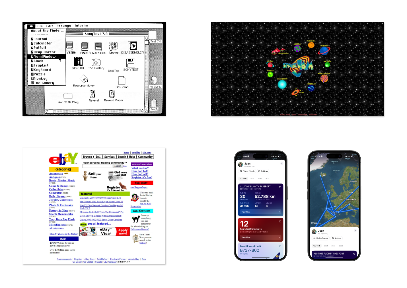
Then came the first visual interfaces as we know them today—invented at Xerox PARC and popularized by Apple in the Macintosh.
From those early GUIs to today, we’ve seen waves of change—influenced by external forces and by internal shifts like accessibility and the move from desktop‑first to mobile‑first. The latter drove design systems like Google’s Material Design, where everything was reduced to its essence to work well on small screens.

Microinteractions
What separates a good digital product from an excellent one? Solving a problem is essential, but there’s more. A beautiful, simple interface is non‑negotiable—but let’s zoom in on the details.
Microinteractions are those subtle animations and transitions that may not change functionality, but create visual pleasure as people interact.
Microinteraction examples
Interact with the elements below to experience different types of microinteractions:
Button with hover
Interactive card
This card reacts to hover and click with subtle animations.
Input with focus
Toggle switch
A good microinteraction is like a spice. Too much and it steals the show; too little and something feels missing.
There are many libraries for this—Motion (formerly Framer Motion) is the most popular. Learn it and collaborate with your designer to decide where to add them. Large systems may favor flat, static interfaces; others may encourage movement and animation. See resources for more examples.
Embrace beauty, reject mediocrity
As noted in the introduction, one of our values is a taste for sophistication and the exquisite.
We should strive to make things beautiful—enjoyable to see and use. It’s not only about function or problem‑solving; it’s about creating positive emotion through what we build.
Aim for that “wow” effect—when people are pleasantly surprised by attention to detail, the flow’s smoothness, or how intuitive and enjoyable the process feels.
This does not rest solely on designers. As discussed in the engineering chapter, excellence is in the details—the small elements that often go unnoticed but make the real difference.
This is where developers frequently shine—covering the invisible yet essential gaps that make the experience memorable. From the smoothness of an animation to the speed of a transition or precision of interactions, each small adjustment contributes to an experience that not only works well but is a pleasure for the senses.
Design debt
Technical debt is widely known by engineers and product teams. It’s common to see tech‑improvement tasks on boards, and increasingly easy to justify paying down this debt early.
Design has a similar concept: design debt. As with code, many factors affect the quality of a product’s design. Some could have been avoided; others are the natural result of iteration over time.
It’s not always our job to identify or solve this, but it’s useful to know. For more, see Linear’s article on how they tackled this in 2024.
Prototyping tools
There are several prototyping tools; the gold standard is Figma. Increasingly, especially in startups, teams value frontend engineers who can spin up a project and build prototypes and interactions to validate concepts. You don’t need to be an expert—learn the basics: layout, prototyping, components, etc.
And don’t rule out code as a prototyping tool. It’s often underrated for being “slower” than Figma—but for a prototype, you don’t need production‑grade practices. Use fake data to avoid wiring APIs. If validated, you’ll already have part of the work done.